Cave, Knife, Features-
How to design a relationship
Cave, Knife, Features - How to design a relationship
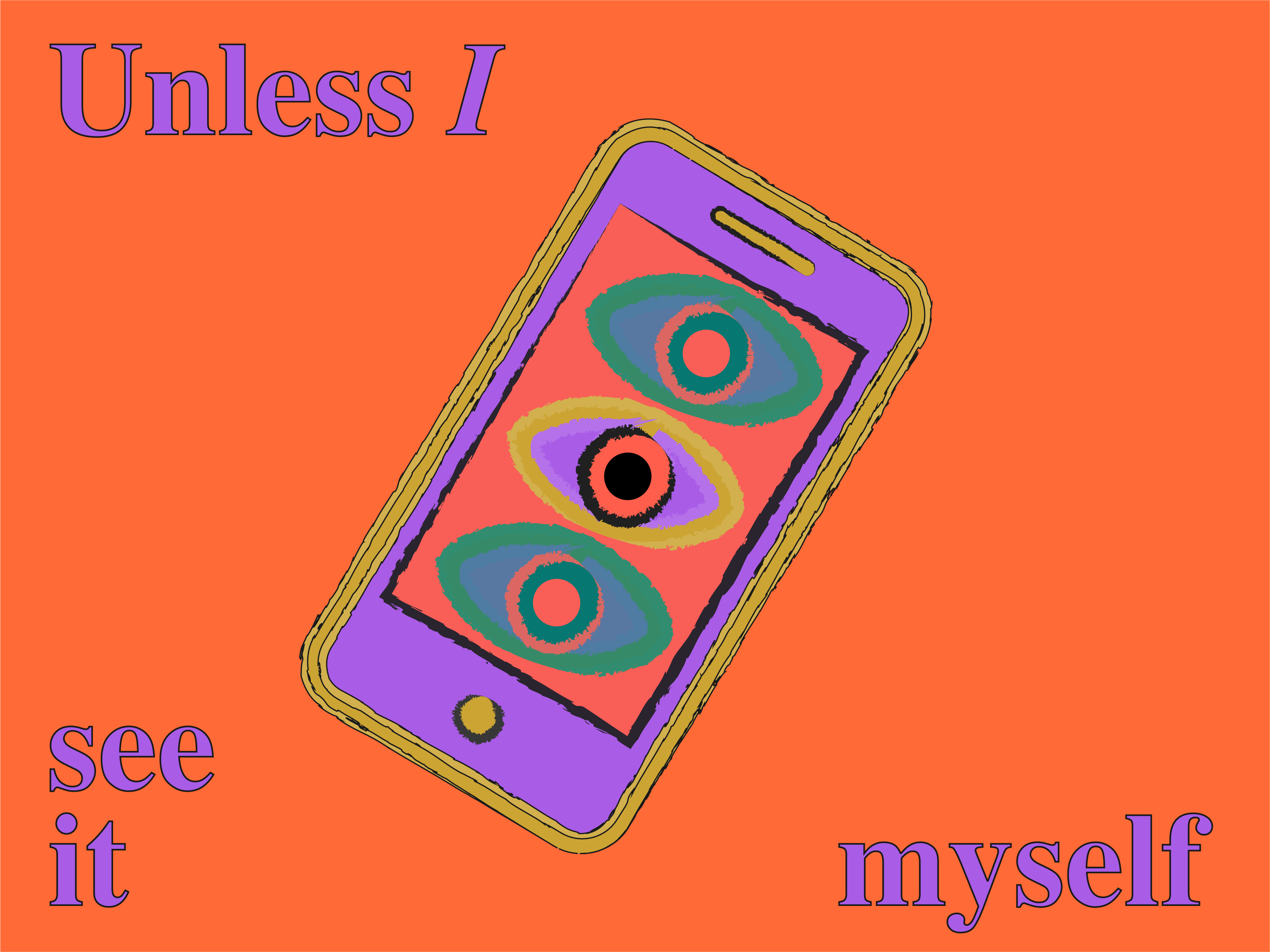
“Why is it that when we encounter a variety of unusual natural objects, we know how to interact with them?”. Don Norman poses this question in his book The Design of Everyday Things. I reflected on it while designing a bank app feature to assist customers in managing multiple accounts.
Affordance
Norman uses the term “affordance” to answer his question. Affordance refers to how an object can be used. For example, a chair affords sitting and lifting, but not for everyone. The affordance of a design exists in the relationship between the qualities of the object and the abilities of the person interacting with it. In a way, to design a digital product is also to design a relationship between a user and a product.
“Strong” vs “Soft” relationship design
Having studied and worked in both Asia and Europe, I explored this idea across various design disciplines. The concept of ‘relationship design’ appears in lectures by Feng Guochuan, a Chinese architect, and Kenya Hara, a prominent Japanese designer. They explore the construction of both ‘Strong’ and ‘Soft’ relationships in product designs.
- A “Strong” relationship design means it is strongly pre-determined how a product should be used.
- A “Soft” relationship implies a lighter and thinner restriction – it’s up to the user to define how to use the product.
Cave
In architecture, the most common strong relationship design is found in our homes. These are designed based on specific functions: dining rooms for eating, bedrooms for sleeping, and living rooms for family activities. Each space serves a clear, functional purpose.
In contrast, a soft relationship design lacks predefined functions. Imagine living in a natural cave: its shapes can be adapted for various uses, such as concave surfaces for sleeping and protruding areas for sitting. You can constantly define new uses of the cave.
Japanese architect Sou Fujimoto applied this concept in designing 'House NA,' where the interior space's function is entirely determined by the user's preferences.
Knife
The strong relationship model can be illustrated with a German chef's knife set. The function of each knife is defined most rationally and optimally. Assorted sizes and shapes serve different purposes. Some knives even have a groove in the handle for the chef’s thumb, and even a best-defined position to hold the knife.
However, a Chinese or Japanese chef would normally use two knives to complete the job. This is because they can adjust the way to hold and use the knife according to the food.
Features
In digital design, the strong and soft relationship models also apply, for example when designing a banking feature in an app. I discovered that some people require highly specific functions to meet their needs, while others prefer a more flexible and unstructured path to explore at first.
Design in between
Sometimes predefined and highly restricted designs work best, while other times, undefined soft relationship design adds an extra perceptual level that can inspire people. A balanced approach often results in the best user experience, offering users the freedom to explore digital spaces and meet their individual needs. Ultimately, design is about crafting affordance, the relationship between people and the product.
How do we understand the beauty of contemporary art?
How do we understand the beauty of contemporary art?
The Oxford Dictionary defines “Art” as the expression of human creativity, often visual, appreciated for its beauty or emotional power. Contemporary art, however, often deviates from traditional forms, which can make visiting modern art museums overwhelming—especially when encountering pieces that seem meaningless or require effort to understand. As a result, many people lose interest in understanding them. So I’m wondering why contemporary art is so difficult to understand and how can we learn from it.
Aesthetics shifts in art
Art critic Arthur Danto questioned why Andy Warhol’s Brillo Box could be considered art while others were not. These distinctions arise from shifts in the aesthetics of art history. Art historian Wang Ruiyun, in her program ‘30,000 Years of Western Art,’ explores these changes
Classical art
Artists pursue the ability to reproduce the world more and more accurately.
Example: Vermeer’s ‘Girl with a Pearl Earring’
Aesthetic: Simulating the beauty of nature and light
Modern art
Artists do not have to draw according to what their eyes see, but according to their subjective wishes, they constantly pursue the purity of art, the lines, the color, and the charm of the shape itself.
Example: Picasso’s ‘Reading’
Aesthetic: Looking for the beauty of form
Contemporary art
Art no longer moves people solely through the charm of ‘shape,’ but rather emphasizes meaning and concept. It’s about who we are and how we live. Contemporary art can appear ugly, weird, vulgar, or even indistinguishable from life itself
Example: Hsieh Deqing’s six durational of ‘One Year Performance’
Aesthetic: Presenting the ‘truth’ and ‘accuracy’ of ideas, as well as the beauty of ‘intensity.’
You don’t know what you can’t see
Many times, when we look at new things, we don’t truly see them; instead, we recognize what we already have in our heads. When encountering new experiences, if we lack relevant context, they may not resonate with us, leading us to ignore them because we don’t know what we don’t know.
Scientific studies reveal that human cognition is influenced by expectations. While only 5% of input comes directly from the retina, 40% originates from the neocortex—our stored knowledge. Marcel Duchamp famously said, ‘A work of art is completed by the viewer.’ Consider Damien Hirst’s ‘The Physical Impossibility of Death in the Mind of Someone Living’: the sculptural material and shape serve as the first layer of the experience, conceptual accuracy from the artist is the second, and the audience’s subjective cognition is the third layer.
Re-construction of facts helps us understand reality better
Film director Jia Zhangke once said, “We need art and literature because they reconstruct facts, allowing us to better understand reality.” In his film ‘Useless,' he edited the fashion designers, assembly line workers, and tailor shops together, and connected stories that happened in Guangzhou, Paris, and Fenyang. In such a structure, it breaks through the limitations of a single view, and you gain a new understanding of clothing and people’s lives.
As the book "The Gate of Perception" mentioned, when an artist touches “truth”, it is not necessarily a pleasant experience. On the contrary, it can be very painful. Because our understanding of facts and reality is based on our own life experience, but our life experience is limited.
Art, however, enables us to expand those limitations and to understand ourselves from a broader perspective. Exploring contemporary art involves embracing its ambiguity, and considering context. It’s a journey of discovery and personal reflection!
Aesthetic Principles in Contemporary Design
Aesthetic Principles in Contemporary Design
When a design looks good, it triggers a positive response in people’s minds, leading them to believe it functions better. This concept is supported by the Laws of UX, which highlight that people are more forgiving of minor usability issues when a product is visually appealing.
Aesthetic in design has emotional and functional power. However, it has a big connection to art history, and to understand this first we have to know the art aesthetic and its shift.
Aesthetic shift in art
From classical art (natural beauty), which aimed to accurately represent the world, to modern art (formal beauty), which focuses on the intrinsic allure of lines, colors, and shapes on a flat surface, and finally to contemporary art (the “beauty” of ideas): the function of expressing beauty has shifted toward expressing truth and goodness, placing more emphasis on how people should live.
Aesthetic in design
The design has inherited the pursuit of formal beauty from modern art, continuing to delve into form and sensory aesthetics. Movements such as Dutch De Stijl and Bauhaus laid the foundation for this exploration, further advanced by later styles like the International Typographic Style. An example in the digital world, think about these flat designs, —such as the logo changes on Instagram, from a realistic vintage camera image to a flat and gradient icon, the International Typographic style is widely regarded as a big influence on the principles of flat design.
Aesthetic in usability
The design also learns from contemporary art in solving human problems. It’s no longer solely about sensory or visual beauty; it now focuses on people’s lives, emphasizing ‘goodness’ and thoughtfulness. An approach like Human-centered design interprets “goodness” and promotes kind design. For example, a mobile banking app that prioritizes accessibility keeps the color contrast and font size comparable, and the user can easily navigate through the keyboard. In the user experience field, emotional design—overarching visceral, functional, and reflective aspects—aligns with this aesthetic shift. For example, the Duolingo app, combined cheerful animations, playful learning steps, and encouraging messages to engage with the practicing.
Modern art theory laid the aesthetic foundation for design, especially the beauty of form. Using the concepts from contemporary art has given design a broader perspective. Beauty is not limited to visual enjoyment but also includes the pursuit of truth and kindness.
How metaphors shape our way of thinking
How metaphors shape our way of thinking
Metaphor lives a secret life all around us, as George Lakoff explained in his book Metaphors We Live By. He said metaphors are not just linguistic expressions but also reflect our view of the world, some obvious examples like: “time is money”, “life is a journey”, “family tree”, etc. There are also many subtle “secret” metaphors we may even not notice, which deeply influence our mind model. There are some basic examples:
Spatial metaphor
As we always naturally interact with the physical environment, we also use spatial sense to make metaphors for abstract things/concepts, so they can be more tangible, for instance, when we describe amounts and quantities, we can say: it goes up, rises, or grows.
Container metaphor
In communication, we conceive of ideas as objects, sentences as containers, and communication as a kind of sending, this is a container metaphor. As when we say we "gather" our ideas, to "put" them "into" words, and if our words aren't "empty" or "hollow," we might get these ideas "across" to a listener, who can "unpack" our words to "extract" their "content."
“Time” in “Space”
Spatial words such as “in” and “at” play a crucial role in our conceptualization of time. For instance, we say “in an hour” or “at ten o’clock.” These linguistic metaphors subtly link time to space. By abstracting these concepts, we can apply them to new domains beyond their original context. Since speaking is correlated with time, and time is metaphorically understood through spatial terms, it is natural for us to conceptualize speaking using space.
How metaphors related to visual design
When we apply the metaphor system to visual expression, it becomes a powerful tool for conveying visual meaning.
Typographic form
Specifically, our spatial concepts, which naturally apply to linguistic expressions, can direct links between form and content in graphic space. Metaphors can give meaning to typographic form, for instance, more of form is more of content.

Color
Colors carry powerful metaphors that influence our perception. For example, energy drinks all tend to display the same color combination of blue, red, and silver to present energy and passion. After a while, this kind of visual metaphor becomes to convention, and people easily respond to this information.
UI elements
In summary, metaphors shape not only our language but also our cognition, influencing how we perceive and interact with the world. They bridge the gap between the abstract and the concrete, enriching our understanding and experiences.
Some notes on creating less mediocre designs

Some notes on creating less mediocre designs
In today’s digital product landscape, designs have shown a trend of templates and lacking uniqueness. As Milton Glaser said in his talk, mediocrity, conformity, and predictability are common in creative work. How can your design stand out? Skilled designers know how to follow and break down the theories and methods of design such as grid, typography, proportion, color, etc. Moreover, great designers recognize that design is a powerful medium for expressing thoughts, opinions, and emotions, leading to more unique outcomes. In my notes, I’ve drawn inspiration from influential designers and broader solutions.
Teaching to see
Training the eye is critical, design educator Inge Druckrey said you can’t come up with ideas if you don’t see first. Observing objects abstractly, as circles or squares, textured or smooth, and then translating what you see into a form language to gain unique insights.
Visual thinking over style
Ernst Keller, a Bauhaus pioneer, proposed thinking visually rather than pursuing beautiful styles. Drawing by hand lays the foundation for this approach, and self-critique is crucial.
A fitting freedom
Determining a level of creative freedom is crucial. Typeface design master Gerrit Noordzij emphasized finding creative freedom within a clear boundary, highlighting that design shines brighter in such circumstances.
Graphic design as a tool for empowerment
Design is not just the application of technology but also a tool for self-expression. Korean designer Na Kim views her design as a way to express thoughts and feelings. She considers it as an empowering tool to expand her influence.
The development comes from failure
Keep developing your brand, way of working, and attitude, which people can recognize, something is fairly narrow, like ‘this person is very good with typography directed in a more feminine way”. Like Milton Glaser said, however, you have to also step out of your comfort zone to try new things, you may discover something in failure, and identify what you can and cannot do. Understanding development comes from failure, people begin to get better when they fail.
By considering these aspects, your designs will become less rigid and more aesthetically impactful.
to be continue...